
Graphical Representation
Graphical Representation Definition
Graphical representation refers to the use of charts and graphs to visually display, analyze, clarify, and interpret numerical data, functions, and other qualitative structures.
FAQs
What is Graphical Representation?
Graphical representation refers to the use of intuitive charts to clearly visualize and simplify data sets. Data is ingested into graphical representation of data software and then represented by a variety of symbols, such as lines on a line chart, bars on a bar chart, or slices on a pie chart, from which users can gain greater insight than by numerical analysis alone.
Representational graphics can quickly illustrate general behavior and highlight phenomenons, anomalies, and relationships between data points that may otherwise be overlooked, and may contribute to predictions and better, data-driven decisions. The types of representational graphics used will depend on the type of data being explored.
Types of Graphical Representation
Data charts are available in a wide variety of maps, diagrams, and graphs that typically include textual titles and legends to denote the purpose, measurement units, and variables of the chart. Choosing the most appropriate chart depends on a variety of different factors -- the nature of the data, the purpose of the chart, and whether a graphical representation of qualitative data or a graphical representation of quantitative data is being depicted. There are dozens of different formats for graphical representation of data. Some of the most popular charts include:
- Bar Graph -- contains a vertical axis and horizontal axis and displays data as rectangular bars with lengths proportional to the values that they represent; a useful visual aid for marketing purposes
- Choropleth -- thematic map in which an aggregate summary of a geographic characteristic within an area is represented by patterns of shading proportionate to a statistical variable
- Flow Chart -- diagram that depicts a workflow graphical representation with the use of arrows and geometric shapes; a useful visual aid for business and finance purposes
- Heatmap -- a colored, two-dimensional matrix of cells in which each cell represents a grouping of data and each cell’s color indicates its relative value
- Histogram – frequency distribution and graphical representation uses adjacent vertical bars erected over discrete intervals to represent the data frequency within a given interval; a useful visual aid for meteorology and environment purposes
- Line Graph – displays continuous data; ideal for predicting future events over time; a useful visual aid for marketing purposes
- Pie Chart -- shows percentage values as a slice of pie; a useful visual aid for marketing purposes
- Pointmap -- CAD & GIS contract mapping and drafting solution that visualizes the location of data on a map by plotting geographic latitude and longitude data
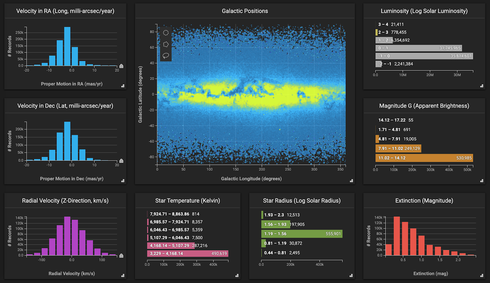
- Scatter plot -- a diagram that shows the relationship between two sets of data, where each dot represents individual pieces of data and each axis represents a quantitative measure
- Stacked Bar Graph -- a graph in which each bar is segmented into parts, with the entire bar representing the whole, and each segment representing different categories of that whole; a useful visual aid for political science and sociology purposes
- Timeline Chart -- a long bar labelled with dates paralleling it that display a list of events in chronological order, a useful visual aid for history charting purposes
- Tree Diagram -- a hierarchical genealogical tree that illustrates a family structure; a useful visual aid for history charting purposes
- Venn Diagram -- consists of multiple overlapping usually circles, each representing a set; the default inner join graphical representation
Proprietary and open source software for graphical representation of data is available in a wide variety of programming languages. Software packages often provide spreadsheets equipped with built-in charting functions.
Advantages and Disadvantages of Graphical Representation of Data
Tabular and graphical representation of data are a vital component in analyzing and understanding large quantities of numerical data and the relationship between data points. Data visualization is one of the most fundamental approaches to data analysis, providing an intuitive and universal means to visualize, abstract, and share complex data patterns. The primary advantages of graphical representation of data are:
- Facilitates and improves learning: graphics make data easy to understand and eliminate language and literacy barriers
- Understanding content: visuals are more effective than text in human understanding
- Flexibility of use: graphical representation can be leveraged in nearly every field involving data
- Increases structured thinking: users can make quick, data-driven decisions at a glance with visual aids
- Supports creative, personalized reports for more engaging and stimulating visual presentations
- Improves communication: analyzing graphs that highlight relevant themes is significantly faster than reading through a descriptive report line by line
- Shows the whole picture: an instantaneous, full view of all variables, time frames, data behavior and relationships
Disadvantages of graphical representation of data typically concern the cost of human effort and resources, the process of selecting the most appropriate graphical and tabular representation of data, greater design complexity of visualizing data, and the potential for human bias.
Why Graphical Representation of Data is Important
Graphic visual representation of information is a crucial component in understanding and identifying patterns and trends in the ever increasing flow of data. Graphical representation enables the quick analysis of large amounts of data at one time and can aid in making predictions and informed decisions. Data visualizations also make collaboration significantly more efficient by using familiar visual metaphors to illustrate relationships and highlight meaning, eliminating complex, long-winded explanations of an otherwise chaotic-looking array of figures.
Data only has value once its significance has been revealed and consumed, and its consumption is best facilitated with graphical representation tools that are designed with human cognition and perception in mind. Human visual processing is very efficient at detecting relationships and changes between sizes, shapes, colors, and quantities. Attempting to gain insight from numerical data alone, especially in big data instances in which there may be billions of rows of data, is exceedingly cumbersome and inefficient.
Does HEAVY.AI Offer a Graphical Representation Solution?
HEAVY.AI's visual analytics platform is an interactive data visualization client that works seamlessly with server-side technologies HEAVY.AIDB and Render to enable data science analysts to easily visualize and instantly interact with massive datasets. Analysts can interact with conventional charts and data tables, as well as big data graphical representations such as massive-scale scatterplots and geo charts. Data visualization contributes to a broad range of use cases, including performance analysis in business and guiding research in academia.