Tips, Tricks + Tasks for the 1.2 Billion Row Taxi Dataset
Download HEAVY.AI Free, a full-featured version available for use at no cost.
GET FREE LICENSEThe taxi dataset is one of the most popular on our site and for good reason, it is not often that you can get behind the wheel of a supercomputer for free.
Still, without direction, it can be hard to uncover the insights in the data that often give our audiences a rush.
With that in mind we will be creating a series of these “cheatsheets” to help you grasp the power of speed at scale. Each post will talk about how to interact with the GPU-powered relational database (MapD Core) using our visual analytics engine (MapD Immerse).
Start by executing the following tasks on the taxi demo (it can be found here).
When you are done, you should be ready to explore on your own.
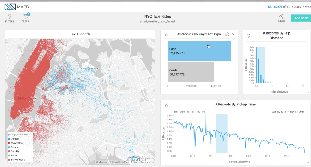
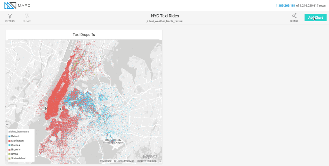
When you fire up the demo, you will be looking at this default dashboard.
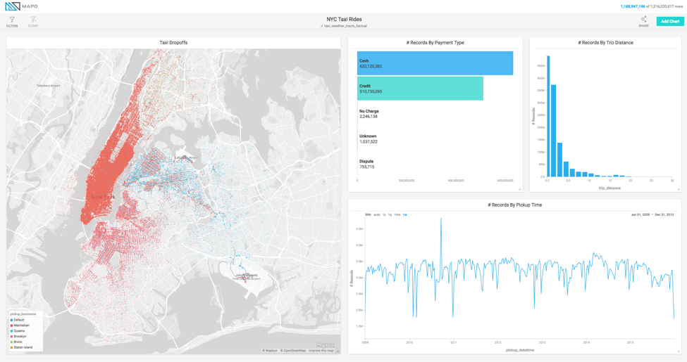
You can make changes to your heart's content, but you can’t save those for obvious reasons.
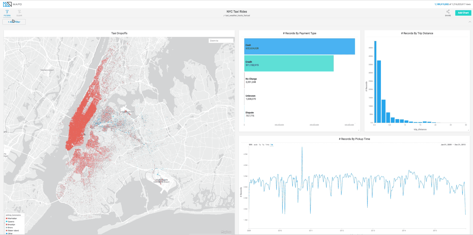
Let’s start by clicking on cash. What’s the overall trend?
Click on Credit (only Credit) and note the exact day that credit card readers were mandated by law in NYC.
Create a time block on the Trip Distance window (upper right) and drag it across. Can you identify what is happening with the colors as your trip distance goes from shorter to longer? What distance effectively shows you the boundary of every borough in Manhattan?
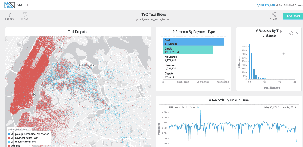
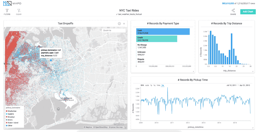
It can be easy to forget you have filters on. One way to know is to look at the filter icon in the upper left. Clicking that will clear all your filters. You can can also clear individual filters one by one.
Let’s clear the filter on trip distance.
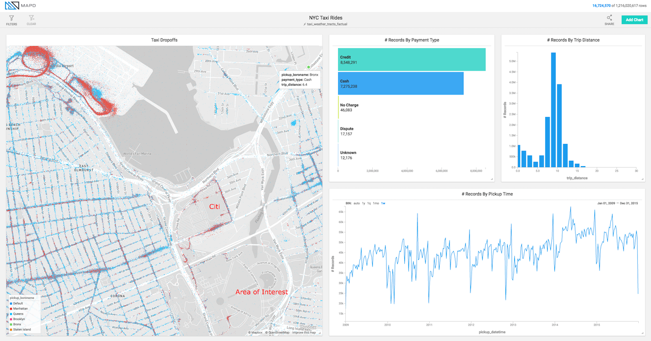
Let’s take this for a spin by zooming into JFK airport. Create a time block on the # of Records by Pickup Time Window around 2010. Drag the time block to the right.
What happens during 2013? It is worth noting that as you drag that time window across, you are executing four queries simultaneously against the 1.2B rows. If you have a good connection it shouldn’t even pause when you drag it.
Unclick all your filters again.
While we are on the subject of airports, locate LaGuardia. Just to the south of LaGuardia is Citi Field (where the Mets play). You should notice some extreme seasonality to the traffic. If you look closely you can see when the Mets were in the World Series in 2015 because the rides keep coming well into the month of October.
There is another spike every September. What besides baseball season could cause that? Hint: narrow your focus to the Area of Interest.
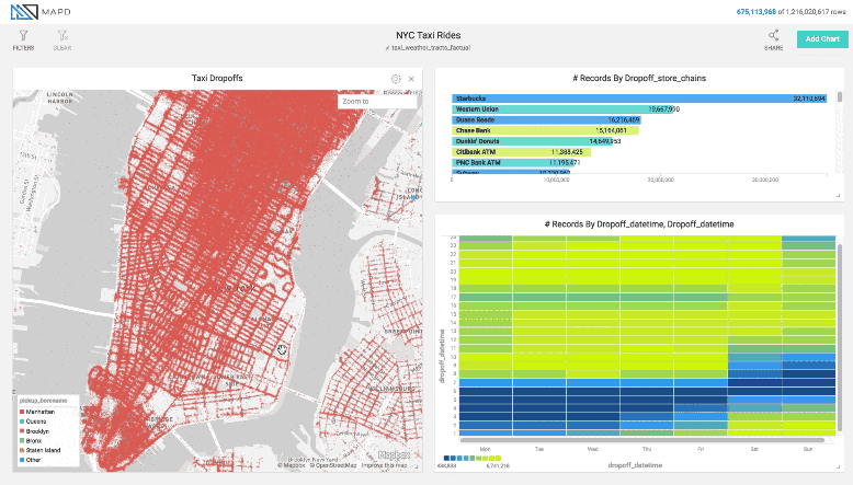
Let’s bring the business level data into the equation.
Let’s start by deleting a few charts to make room for our new charts. Simply hit the x in the upper right corner of each chart.
Next select apply chart and let’s build out a list of all the businesses in NYC. We will look at the stores that taxis dropped off at and the number of people that were dropped off there. The data uses the latitude and longitude of the end of the trip and we select the business within 30 meters (about 100 feet) of that dropoff.
The first dimension is dropoffstorechains and the second one is # of records. The default is table but let’s select rows. Click Apply.
Let’s add a heatmap.
Heatmaps require an X and Y axis. In this case, let’s make the X axis the dropoffdatetime but select “Extract” and choose Day of the Week. To “select” that just click outside of the window. For the Y axis, we choose dropoffdatetime again, but under “Extract” we select hour.
Next we select the # of records under measures and viola, we have a heatmap. Click Apply.
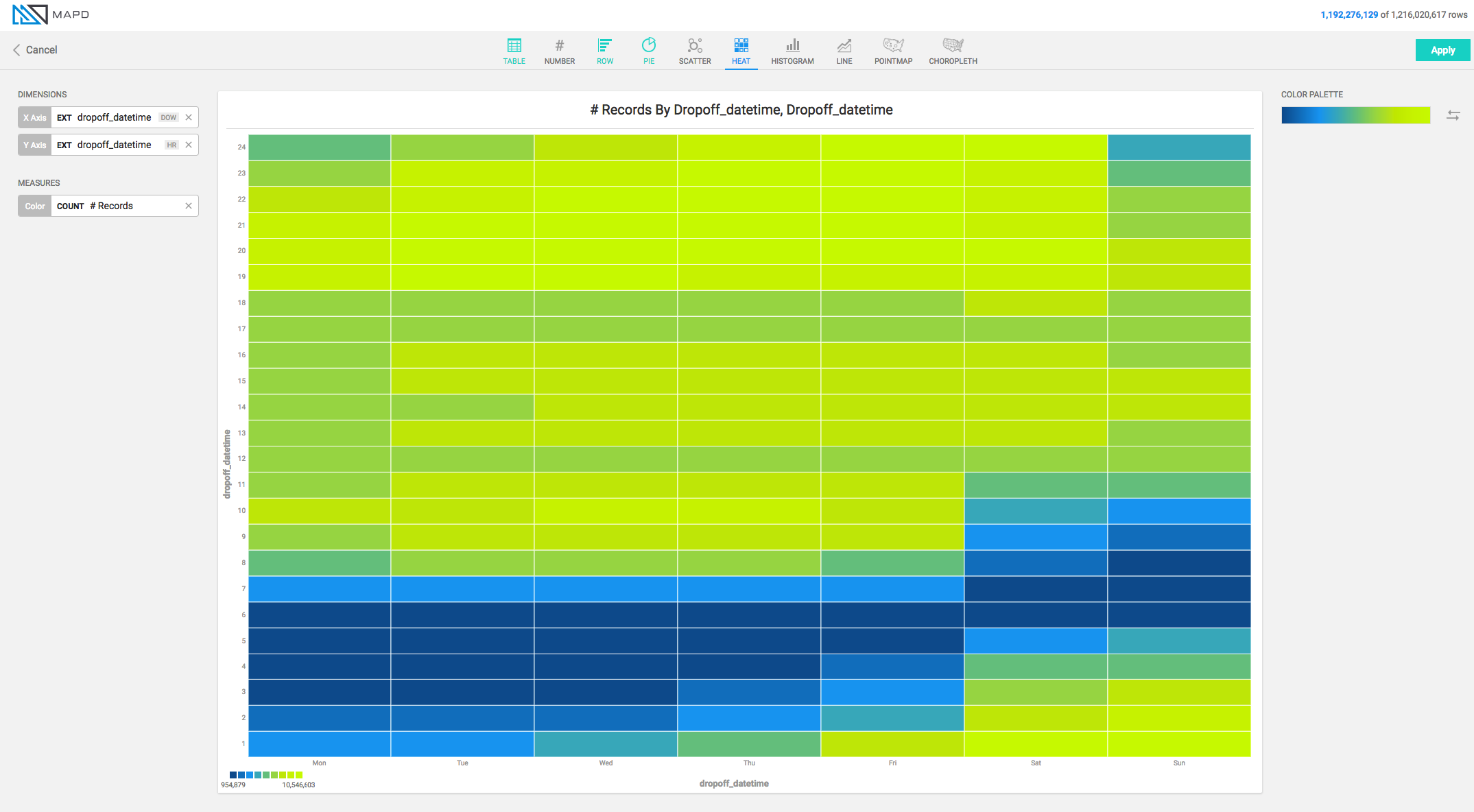
From here you can filter by store to see traffic patterns. Looking at Krispy Kreme for example we see that most folks frequent the legendary donut shop on weekends. We also see some folks starting relax their diets on Friday (think office goers buying for colleagues).

This same behavior let’s you explore different chains and different parts of the city. Take for example the Alphabet City neighborhood. If you were a CIA analyst doing pattern of life analysis - what would your takeaway be? Hint, look at when dropoffs concentrate. What is going on in that area at that time of day (or more appropriately night)? How could you validate that behavior?
Last tidbit before you run amok through the city. The platform supports custom SQL. To access that functionality select filters, then custom, then type your query. For example, if we wanted to see all the rides for which the tip amount was greater than 20% we would craft the following SQL statement:
tip_amount > cast(.2 as float) * fare_amount
Then from filter, we would select Custom and enter the query. Now you can see who tipped and what the trends were.
If you have gotten this far, you are well on your way to unlocking many of the secrets held by this dataset but more importantly you are learning how to drive a supercomputer. There are dozens of additional attributes you can graph, plot and heatmap - all of which will slice through the 1.2 billion rows like a knife through butter courtesy of the world's fastest data exploration engine.
Again, if you find something cool, point it out on Twitter. If we add it to this post, we will send you a hoodie.
In the meantime - enjoy!