Ten Dynamic Examples of Visualizing Big Data
Download HEAVY.AI Free, a full-featured version available for use at no cost.
GET FREE LICENSENOTE: OMNISCI IS NOW HEAVY.AI
The surging volume of available raw data is causing major information overload. But in the data lie incredible potential. The challenge is how to paint a picture with big data in a way that humans find easy to understand. The answer is modern data visualizations.
The majority of sensory processing in humans is visual, operating at approximately 13 milliseconds to process an image. The unconscious, “pre-attentive” visual process recognizes attributes such as color, form, motion, and position in an instant. Common types of data visualization include pie charts, line charts, graphs, bar charts, scatter plots, histograms, and heat maps.
Data visualizations are a crucial component of data analysis, data science and big data analytics. Visual information processing aids data scientists and data analysts in decision-making, exploration and discovery, communication, and in presenting data in a consumable format. Decision makers can then use these visual aids to better understand their data, communicate their insights, and make better, data-driven business decisions.
But big data data visualizations can also be entertaining, beautiful, humorous, and enlightening to the average reader trying to understand the real life data around them. With the use of big data visualization tools, and a little bit of creativity, we can translate dense, abstract, unintelligible data sets into visual representations that humans can immediately understand and contextualize. Read on to see some of the most effective examples of visualizing big data.
Drowning in Plastic

Just how much plastic are we generating daily? This big data visualization example, designed by Reuters Graphics, depicts the sheer volume of garbage we create every day as compared to famous landmarks. Using well known landscapes and objects as comparison creates a scale the human eye can instantly recognize and comprehend.
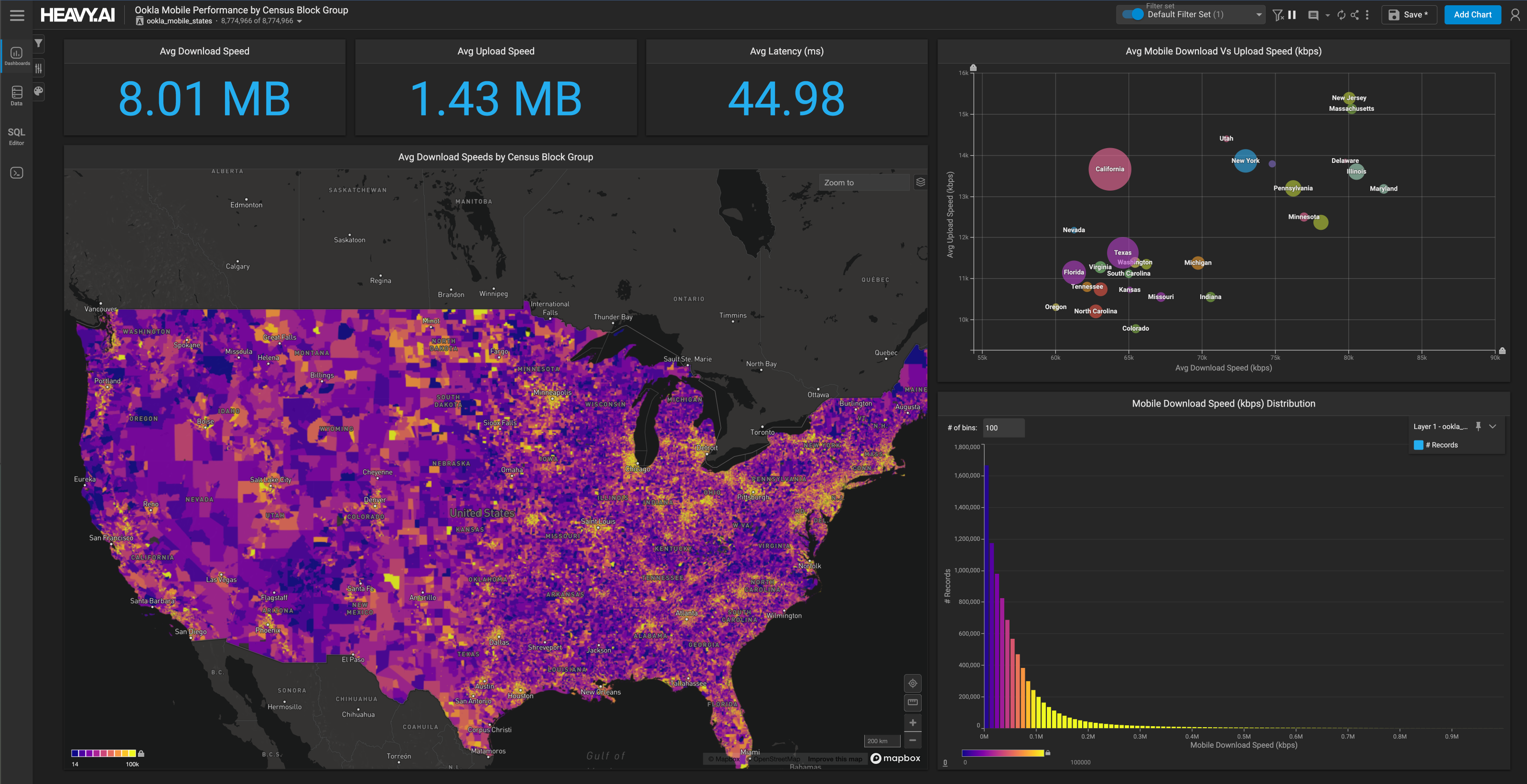
Understanding Firewall Data

Detecting anomalies in firewall traffic as fast as possible is crucial for security. The ability to detect unusual traffic patterns, not only from previously known attacks, but also new, evolving ones, requires machine learning-based systems. This involves enormous quantities of data that cybersecurity professionals must quickly explore, visualize, and analyze. This example of interactive visual analytics for big data designed with OmniSci's visual analytics platform provides an unbound visual analytics and dashboarding experience where anyone can easily track, understand, analyze, gain insights from, and identify patterns and trends in firewall data in real time.
The Scale of the Universe

Just how small is an atom? How big is our solar system? Nikon’s “Universcale” big data visualization features an interactive scrolling bar that indicates a scale position, introducing familiar objects that help the viewer grasp the relative sizes of everything. The scale starts with a minuscule Femtometer and expands to Light-Years in the outer extremities of space. Interactive data visualization techniques let the viewer control gain perspective on complex data sets with a simple click or scroll of their mouse.
Mapping Wealth Distribution

Esri uses geospatial visualization tools and techniques to map out income disparity across major cities in America. “Mapping Incomes” shows data in a scatterplot to highlight the deepening divide between the rich and poor. This interactive map uses geospatial visualizations and census data to reveal and explore patterns, relationships, and trends in income and geography.
The Dawn Wall

The white-knuckle free-climb featured in Josh Lowell and Peter Mortimer’s 2018 documentary “The Dawn Wall” left viewers reeling at Tommy Caldwell and Kevin Jorgeson’s ascent up the sheer face of El Capitan’s Dawn Wall in Yosemite National Park. The New York Times’ interactive, stunning example of visualizing big data takes audiences on a journey up the wall with the use of 3-D renderings created by M. Jaboyedoff, B. Matasci, and A. Guerin of the University of Lausanne.
NASA’s Perpetual Ocean

This big data visualization, created as part of NASA’s Estimating the Circulation and Climate of the Ocean (ECCO) project, shows ocean surface currents from June 2005 to December 2007 from NASA satellites. A combination of advanced mathematical tools and MIT numerical ocean model observations provide realistic descriptions of the evolution of ocean circulation. Practical applications include quantifying the ocean's role in the global carbon cycle. Data used by the ECCO project include: sea surface height, gravity, surface wind stress, sea surface temperature, sea ice concentration and velocity, and temperature and salinity profiles.
BP Oil Spill

The British Petroleum (BP) Macondo well’s destruction of the Deepwater Horizon oil rig in the Gulf of Mexico in 2010 had a devastating impact on the environment. The ensuing disaster response efforts employed advanced cyberinfrastructure to mitigate the effects of the disaster, assess the full scope of the damage, inform response efforts, and forecast the spill’s impact on the Gulf Coast. This immersive, 3-D big data visualization was designed using computational fluid dynamics simulation data, showing the movements of oil particles through water with color coded ribbons.
Presidential Candidate Connections

The New York Times’ “Connecting the Dots Behind the 2016 Presidential Candidates” is an example of visualizing big data that uses dots, or bubbles, with a tree branch system depicting how a candidate’s team is connected to previous campaigns, administrations, and organizations close to the possible nominees. “Connecting the Dots” transforms a large, disconnected, tedious data set into a simple, interactive, political “family tree.”
Generation Diversity

CNN’s Annalyn Kurtz and Tal Yellin designed this interactive stack chart with data collected from the US Census to highlight the diversity of each generation. Big data and visualization work in tandem to help the average person easily identify cultural trends and patterns from enormous, otherwise seemingly disconnected sets of facts and figures by providing a colorful chart in which readers can simply roll their mouse over the chart to see their generation’s statistics on population, race, and age.
World Tweet Map

Progressive visual analytics for big data is dependent on the availability of a robust and flexible platform to cope with the data and streamline workflows. OmniSci’s immersive analytics platform and Vega Visualization work together to create stunning, interactive big data visualizations of high-cardinality data. In-situ rendering of on-GPU query results accelerates the visualization of grain-level data with zero-latency visual interaction at any scale. This interactive geospatial visualization of Twitter Tweets from around the world displays the top hashtags trending, the number of tweets per hour on a given date, and a color coded point map indicating language and exact location where a Tweet was posted.
The sheer volume and velocity at which data is currently being generated can be daunting. We have more information at our fingertips than our brains can process, and without the proper tools to harness it, we risk losing valuable insights. These big data visualization examples show how to manipulate big data to our advantage with cutting edge data science and interactive data visualizations. With the right tools and techniques, big data can be as beautiful as it is enlightening.