How We Develop Meaningful Visuals for Dot Density Dashboards
Download HEAVY.AI Free, a full-featured version available for use at no cost.
GET FREE LICENSE
Last month we released our Census Dot Density demonstration, which maps data from the 1990, 2000, 2010, and 2020 censuses representing over a billion points at the one person to one dot resolution.
With these three decades of data and intuitive maps and charts, we ended up with a set of dashboards that allow us to explore and interrogate 30 years of US population changes at the very granular census block group level.
To best show you all the results and how we made it possible, we prepared a three-part blog series, a collection of videos, and published a public demo so you can explore your neighborhood or hometown.
This three-part blog series will show you the following:
- The first part explores some of the surprising knowledge gained from the analysis and visualizations.
- The second part discusses how we acquired the data for each census, and the Python notebooks used to turn the census block group polygons into individual points.
- The final part (the remainder of this post) explores how we created the charts, maps, and dashboards in Heavy Immerse.
Let's dive right in!
What We Wanted to Explore
Before building the dashboards, we stopped to consider the questions we wanted to pose to users of the dashboard:
- How has overall population density varied from neighborhood to neighborhood?
- How has the general population increased, declined, or stayed the same in different areas over time?
- How has neighborhood-level racial makeup changed over time?
- How has the racial makeup (as a percentage) changed over time?
- How many people (# of dots) appear in the map view at any given time?
- How was the data sourced?
We began crafting the charts, maps, and graphs you see in today's demo with these questions in mind.
Creating the Dashboard Charts
There are many chart types to choose from, but the primary dot density dashboard consists of a points map, two combo charts, a collection of numeric charts, and a text chart.
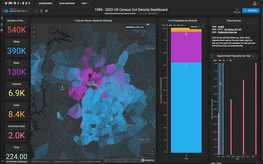
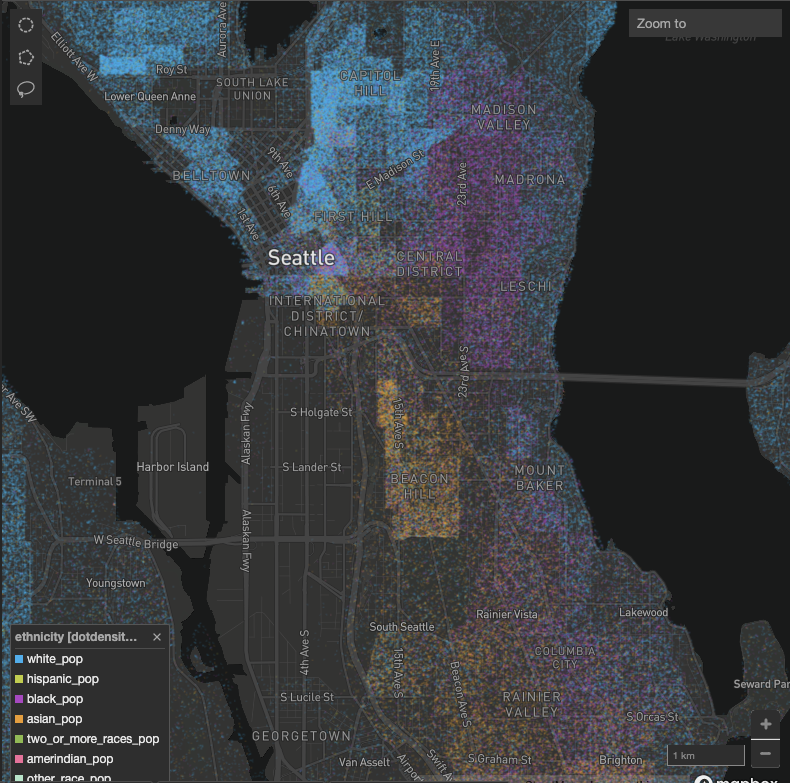
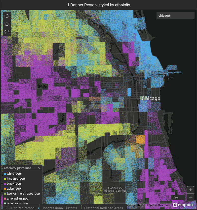
Point Map
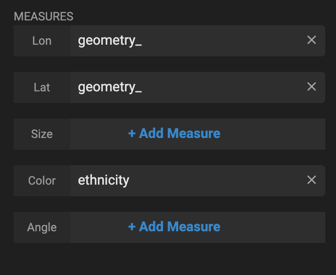
A point map is undoubtedly the core of a dot density dashboard. The points are easy to set up using the geometry column and ethnicity as the color:
We added the map twice so we could set up zoom-based styling.

From zoom level 0 to zoom level 12, the points are at size 1. After zoom level 12, they are a size 2. This makes it easier to notice relative density at zoomed out (state and county) levels but still see the individual points when zoomed in at the street level.
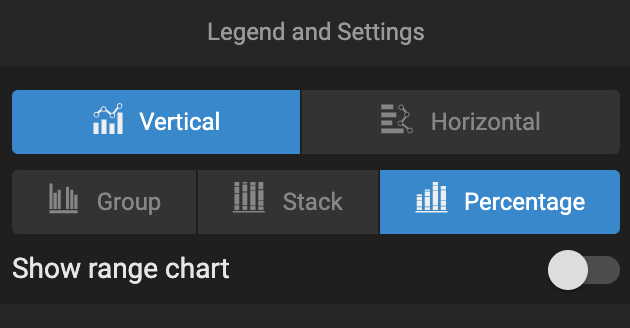
New Combo Charts
The New Combo Charts allow users to understand how demographic percentages and population totals have changed over time.
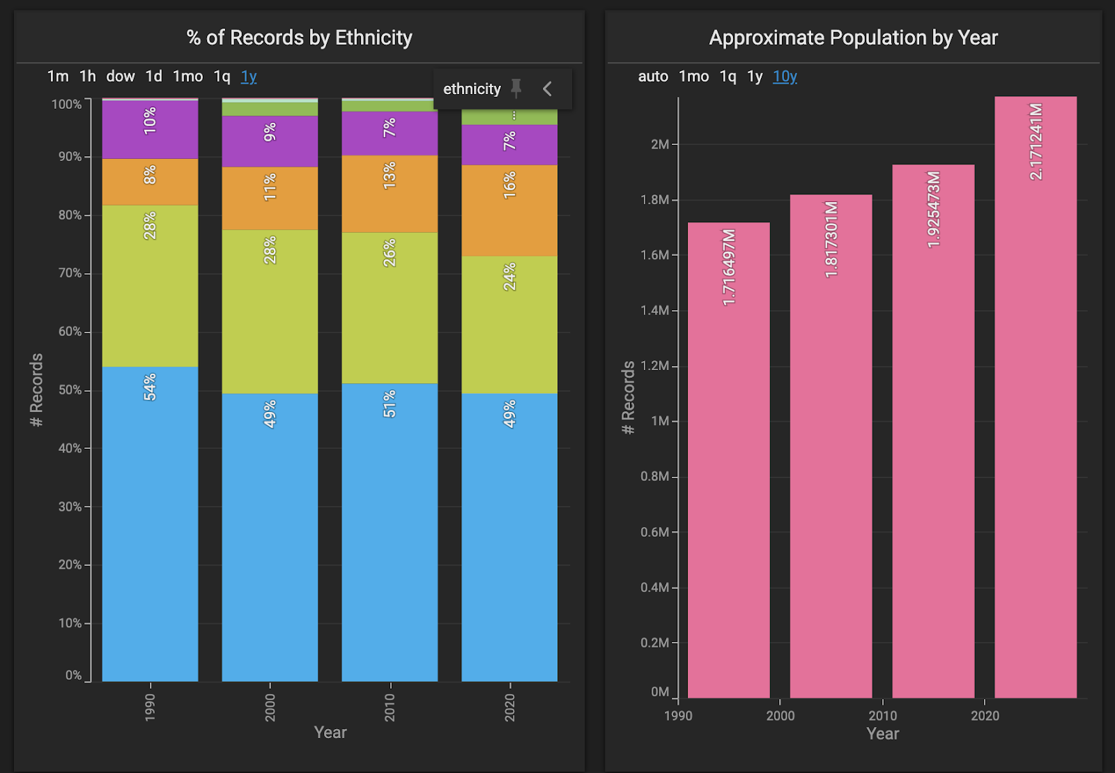
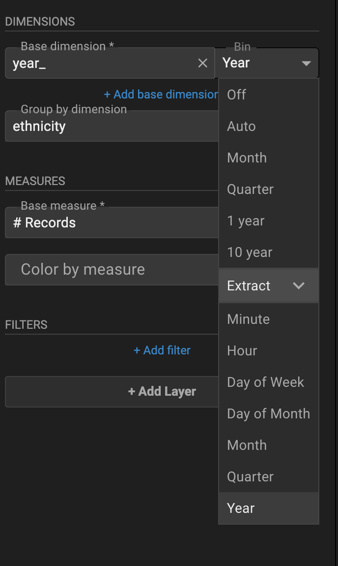
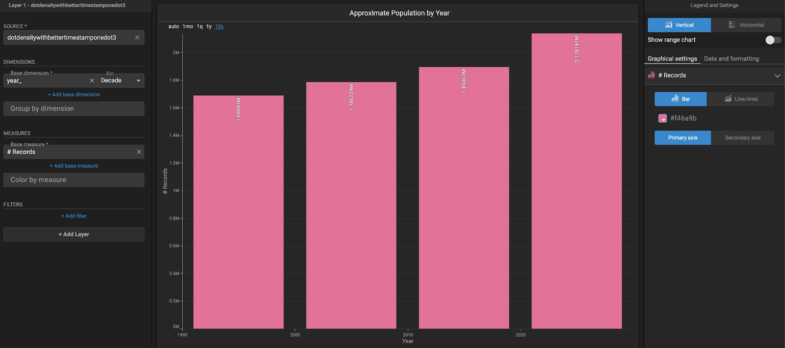
One of the critical parts to setting up the New Combo Chart here is extracting the year value from the year_ DateTime field. It will only show the discrete four buckets of years (e.g., 2000) and not show gaps between them.
The ethnicity percentages chart is created by grouping by the ethnicity column and setting the display to percentage.

This makes for an effective graphic that shows changes in percentages over time as the user pans, zooms, or selects a part of the map with something like the lasso tool.
The other New Combo Chart bins on the decade setting, allowing the user to see the total change in population over the four buckets and drag/brush between the years.

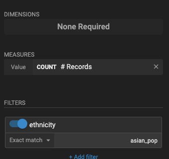
Number Chart
The number charts tell the user how many points for each ethnicity are in the map view at any given time. They are simple to set up with # Records in the measures section and a filter for the specific ethnicity.
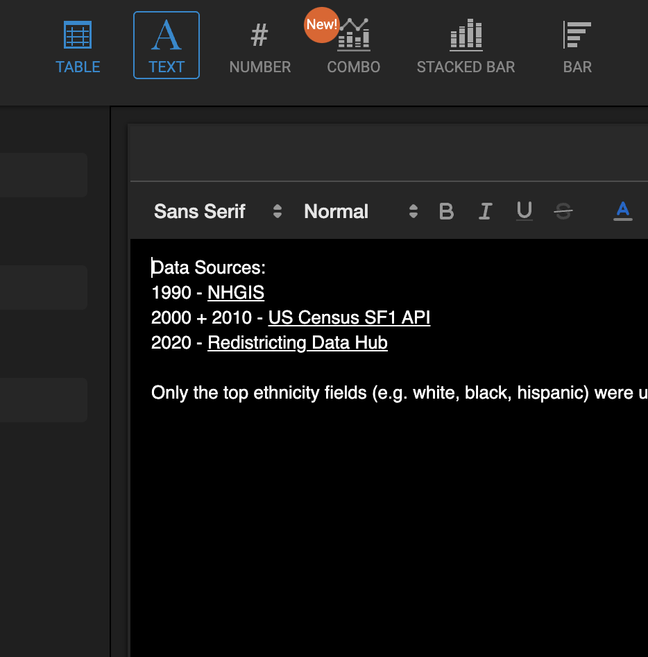
Text Box Chart
Finally, the text box is straightforward and tells the user how we sourced the data.
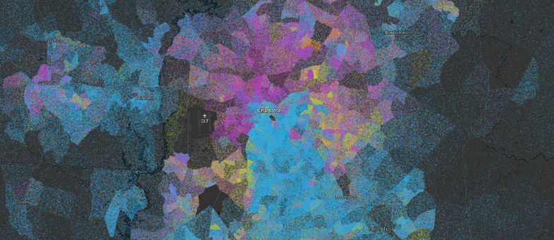
300 People Per Point Dot Density Maps
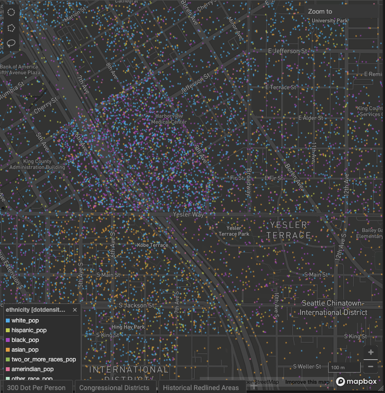
One person per dot is incredibly effective as visualizing population data at certain zoom levels. At a city-level zoom of approximately 11, you can see a level of detail and granularity that helps you understand demographics and population density in a way that no other visual can.
But at lower zoom levels, it can get a bit cluttered and more challenging to see edges between the points.

We ran the same scripts to create one point for every 300 people to see how it would look.

The resulting map is easier to read at lower zoom levels (i.e., more zoomed out). The challenge with using fewer than one dot per person is that there won't be dots in areas where the block group has fewer than 300 people for that ethnicity. This throws off the overall counts and percentages a fair amount, as many dots are removed entirely from the map.
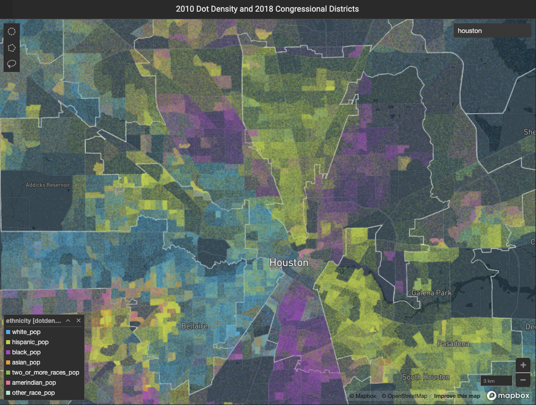
Redlining and Redistricting
A dot density dashboard (with four censuses) is certainly exciting on its own. But the dot density layer can also be used with other data and layers to help people understand different phenomena that pertain to population density and demographic changes.
We thought this dot density point layer could be interesting to use in a map of congressional districts and historically redlined areas of cities.
We created two additional tabs with polygon layers for the congressional districts and the historically redlined areas.
These are relatively simple maps with two layers, and the key was to find the right amount of opacity for the points and polygons so that a user can make sense of both.


There's no perfect way to design a dashboard, but we think that the combination of charts that we included here addresses the questions we posed at the beginning of this post.
- How has overall population density varied from neighborhood to neighborhood?
- How has the general population increased, declined, or stayed the same in different areas over time?
- How has neighborhood-level racial makeup changed over time?
- How has the racial makeup (as a percentage) changed over time?
- How many people (# of dots) appear in the map view at any given time?
- How was the data sourced?
Explore the dashboards for yourself here!
We'd love to hear about your findings once you've used the dashboard, as well as any feedback you may have. Please share those thoughts and experiences with us on LinkedIn, Twitter, or our Community Forums!