Flying Through Flights Data with MapD
Download HEAVY.AI Free, a full-featured version available for use at no cost.
GET FREE LICENSEA few years back, the American Statistical Association put out a dataset of hundreds of millions of US airline flights from 1987 to 2008, as part of a supercomputing competition. The dataset includes every single flight record known by Bureau of Transportation Statistics for that two decade period; every prop plane, every jet plane, balloon or blimp.
We wanted to put the MapD database and visualization software through its paces, as well as help you figure out whether your local airport is guaranteed to make you late, so we’re making this US flights demonstration available today.
Feel free to explore the dataset and create new charts and views as you like, and if you have questions or want to see MapD on your own data, let us know.
One of the valuable things about MapD’s GPU-powered database and visualization software is that a 124 million row dataset like this can be quickly and easily explored in a stream-of-consciousness type of way, since MapD’s query response times are instantaneous, and the visualization dashboard is drag-and-drop WYSIWIG.
Here are some findings about air travel that jumped out at us after a quick spin through the data.
First, some truisms.
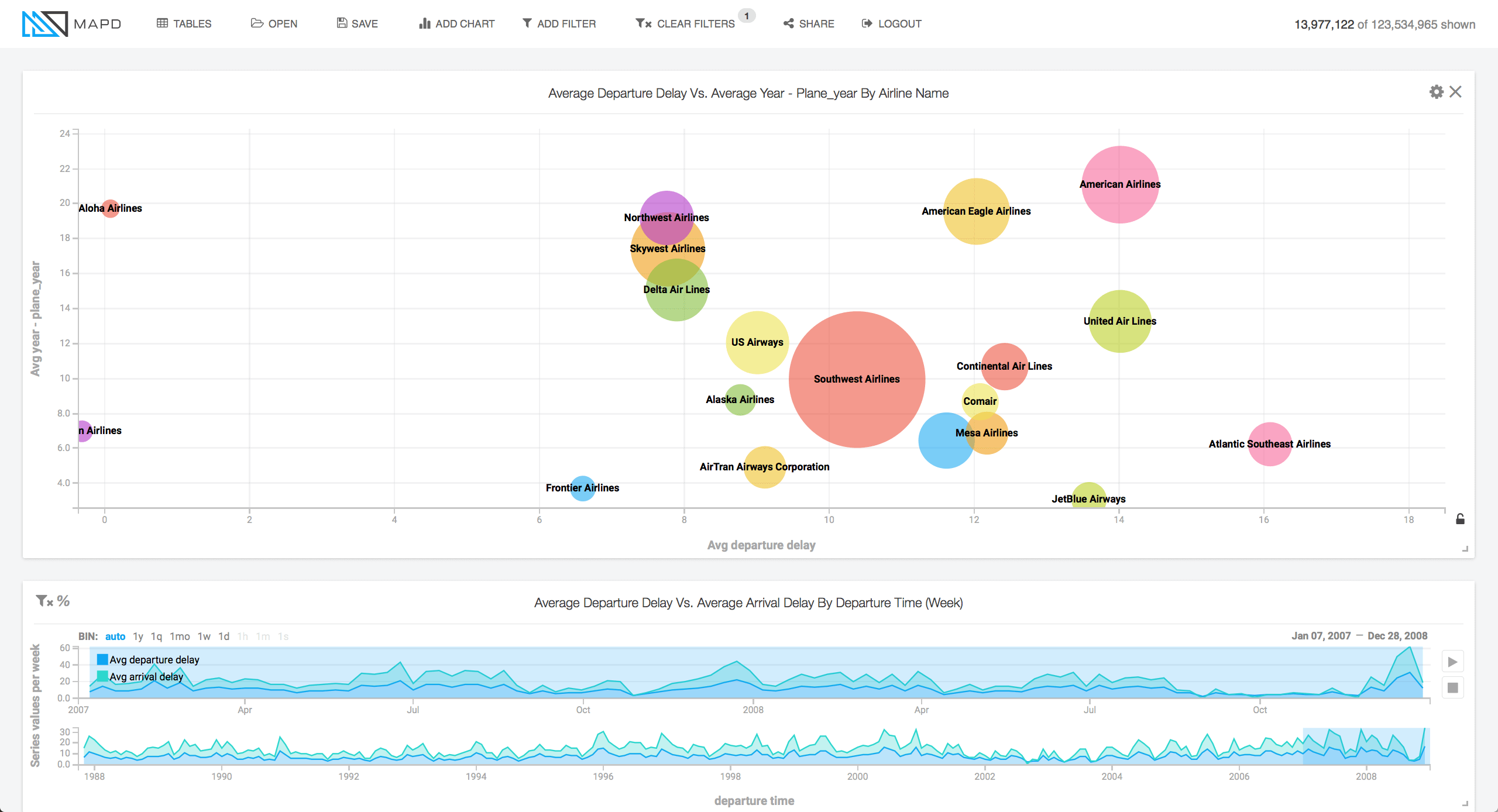
Old planes break down more than new planes.
See the falling slope on the histogram at the right side of the dashboard here. Planes toward the left side of the histogram are older, planes on the right are newer. Not surprisingly, newer planes have smaller average delays.
Of course, if you dig a little deeper, there’s more to the story on old planes. The scatter plot below shows age of plane on Y-axis, and average departure delay on X-axis (size of the dots equals number of flights flown by the carrier). American Airlines, at upper right on the chart, takes the cake for oldest fleet, along with some hefty delays. Jetblue (toward lower right in green) interestingly has a very new fleet, but terrible delays. Aloha Airlines (far left, top) ran right on time in spite of its old fleet, probably because of reliable Hawaiian weather and lack of hub type traffic. Unfortunately, its puddle jumpers jump puddles no more (it ceased operations in 2008).
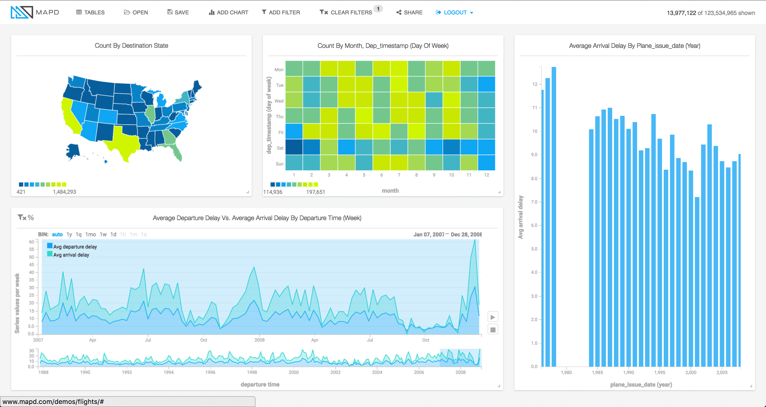
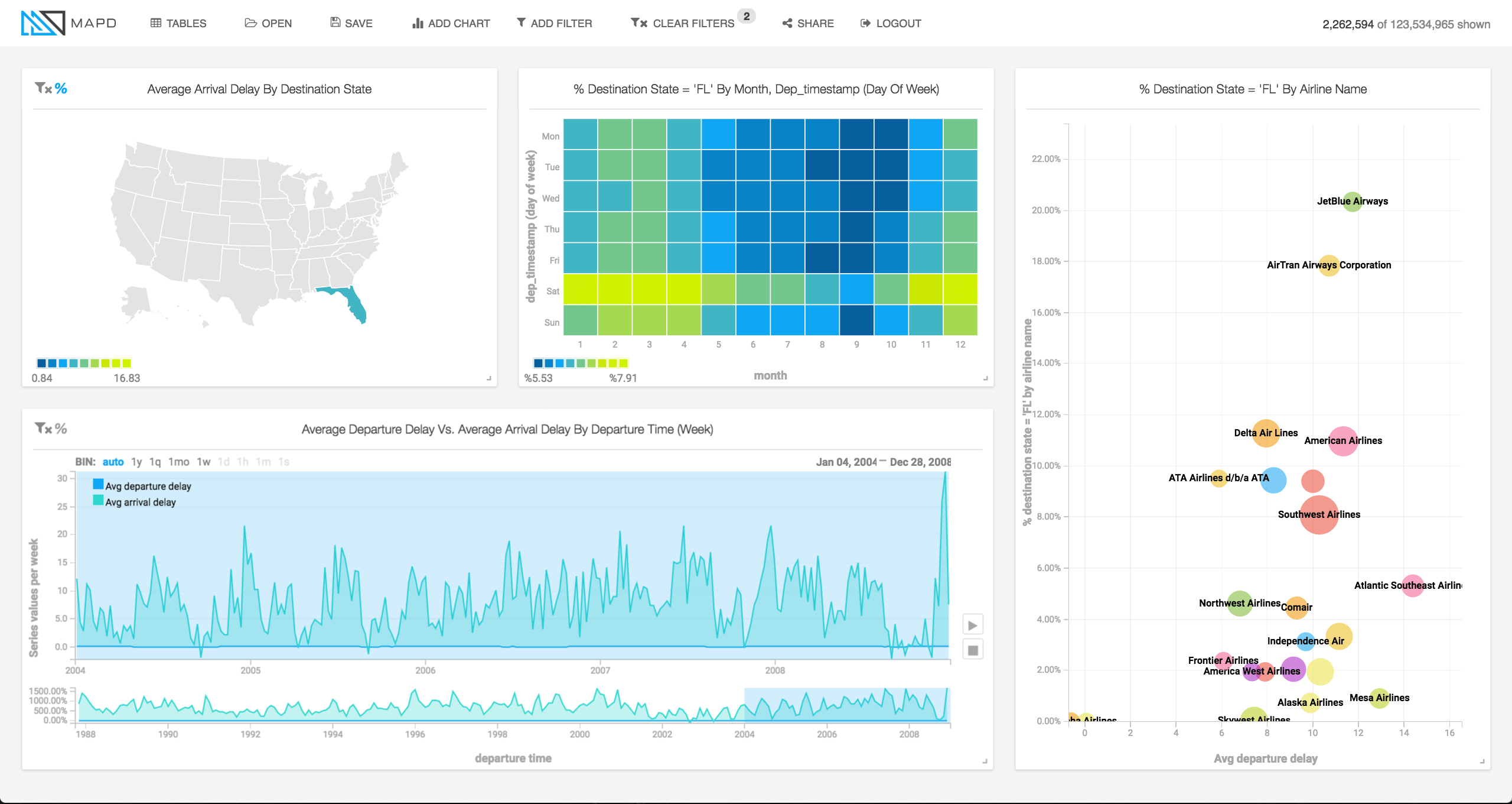
People visit Florida on weekends, not for work.
Notice the yellow horizontal strip in the heatmap at center. Y-axis is days of week here, and X-axis months of the year. People fly to Florida proportionally more on Saturdays, and they fly there more in winter months than in the heat of summer.
New York is not a weekend destination.
Looking at the same heatmap chart for flights to New York, it seems clear New York is for the work week, regardless of the season.
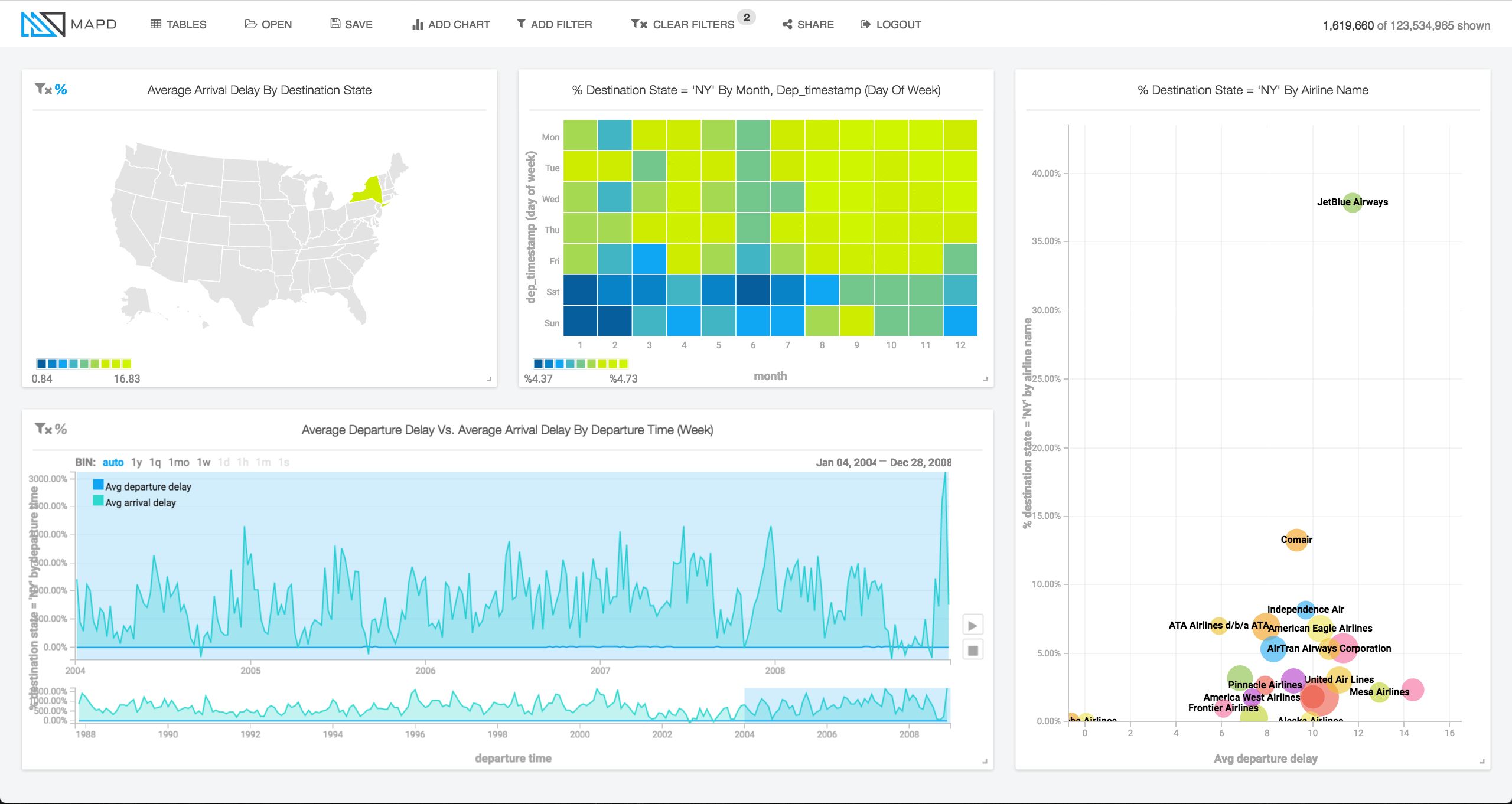
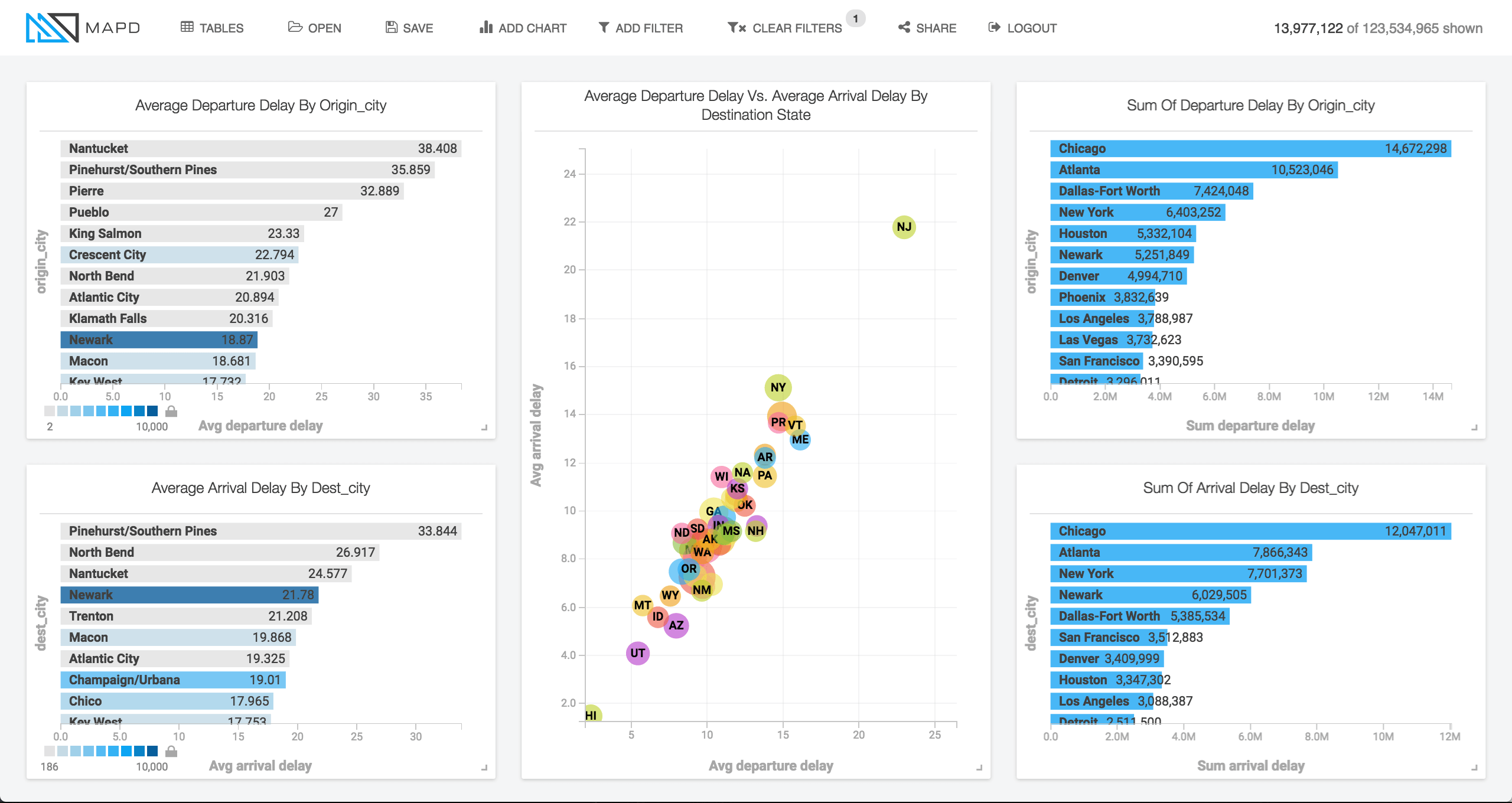
Hawaii is lovely, and New Jersey is not.
Yes, that’s right. If you have a look at the scatterplot in the middle below, which graphs average arrival delay on the Y-axis and average departure delay on the X-axis, New Jersey soars above the pack in terms of travel agony. While in Hawaii (lower left of scatterplot) in addition to giving you flowers when you arrive, they give you punctuality. For New Jersey, you might think that problems were isolated to the busy Newark airport, but as you can see in the bar chart at lower left, Trenton and Atlantic City also make an appearance near the top of airports with the worst arrival delays.
The toughest airport to fly out of is windswept Nantucket (bar chart at upper left). The bar charts at the right side show that while Chicago and Atlanta may not be worst in terms of average delay time, they cause the most cumulative delayed time overall (due to very high traffic plus frequent delays).
Finally, one of the powerful aspects of the MapD system is that because of our ability to leverage the massive parallel compute power of GPUs, we do not need to rely on indexing, aggregation or pre-calculation of data in order to deliver interactive speeds. That means that if an analyst spots something unusual which he wants to dig into, we can immediately expose the individual database records underlying the anomaly. An analyst is able to search, tweak, and search again in any arbitrary direction, and never have to wait for a slow answer, no matter the level of detail.
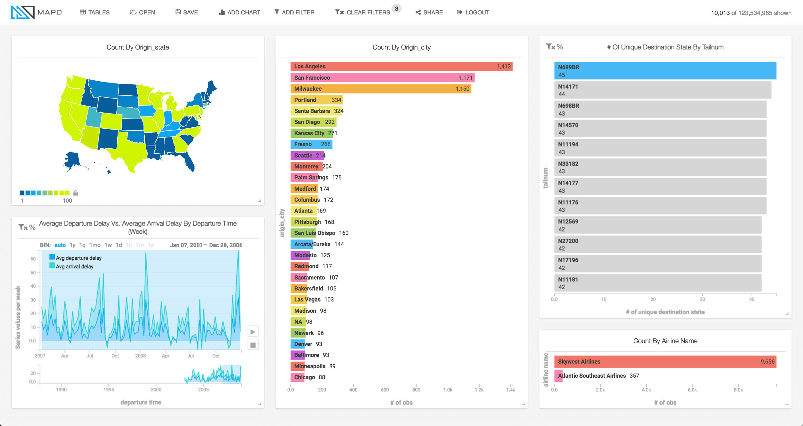
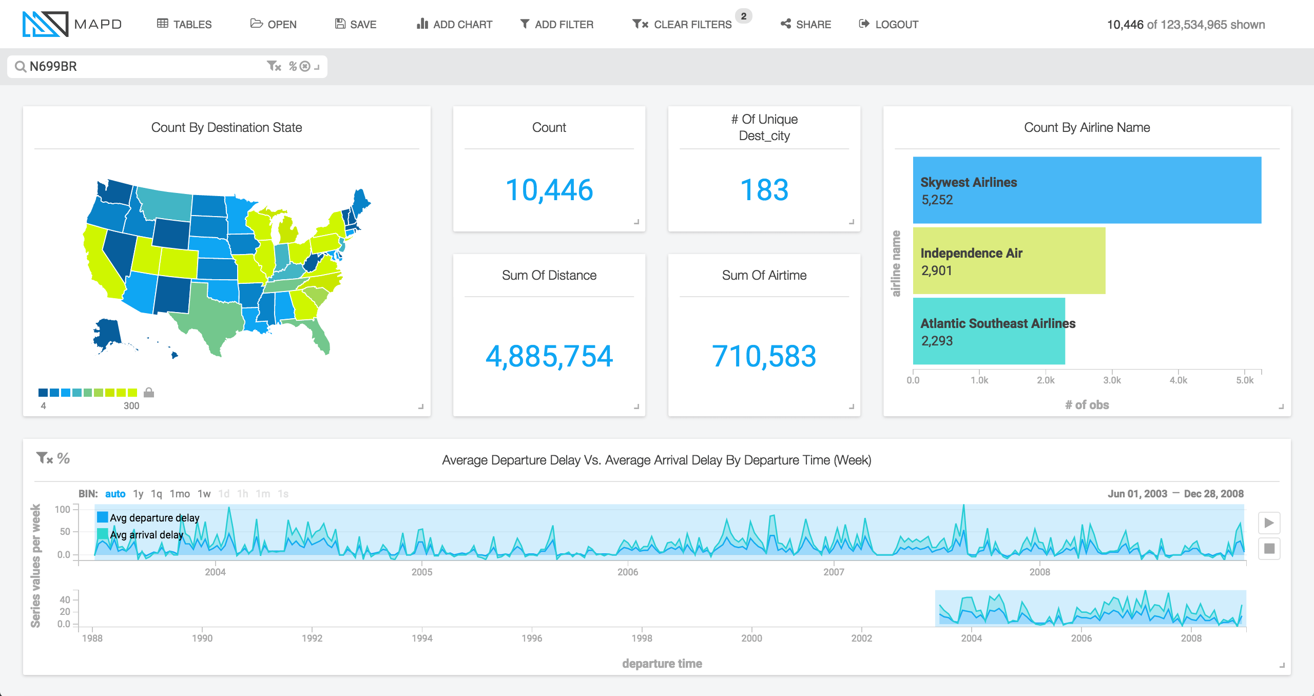
In looking at this data, we noticed that there are some planes which put in some incredible amounts of travel time. See for example Skywest Airlines’ little plane that could, tail number N699BR, which visited 45 states in the two years 2007-08 (right bar chart) and called on airports across the country (middle bar chart).
Digging in further on this plane, we see that it’s flown under 3 airlines since it appeared in 2003. First Independence Air (now defunct), then Atlantic Southeast Airlines (a subsidiary of Skywest), and finally under Skywest itself. The plane flew more than 10,000 flights from 2003-2008, visiting 183 cities and travelling almost 5 million miles. It spent the equivalent of almost 500 24-hour days aloft during the period (710,583 minutes), giving it an average speed of 413mph. It’s no surprise it has it’s own well deserved planewatcher fan club online.
We hope you enjoy exploring this flights dataset using MapD, and please get in touch with any questions or comments!