100 Years, 100 Million Records
Download HEAVY.AI Free, a full-featured version available for use at no cost.
GET FREE LICENSE
The Global Historical Climatology Network (GHCN) is a dataset of temperature and precipitation records maintained by the National Oceanic and Atmospheric Administration (NOAA).
There are approximately 35,000 temperature reading stations (and many more precipitation stations), with some records dating back to 1763.
It doesn't get any better than this dataset for those interested in learning more about climate change at a massive spatiotemporal scale.
The following tutorial will use HEAVY.AI's JupyterLab integration and Immerse to ingest, analyze, and visualize GHCN data.
Loading the GHCN Data into HEAVY.AI
The GHCN data is available via BigQuery, S3, and many other sources as CSV files representing each year.
The file representing the year 1763 has 730 rows, while the 2020 file has over two million. Most of the rows are a mix of maximum temperature (TMAX), minimum temperature (TMIN), precipitation (PRCP), average temperature (TAVG) readings, and the sensor id.
We limited our ingestion to average temperature readings taken between 1900 and 2021. Below is the notebook code we used to import these CSV files into an HEAVY.AI table.
The first step was to install the pyHEAVY library using pip. This library makes it easy to work with and connect to HEAVY.AI in a Jupyter notebook environment.
The next step was to create a connection object with HEAVY.AI using connect.
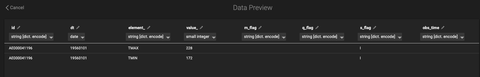
Next, we created a table in HEAVY.AI to load data into using Python. One way to do this is to take a small CSV example file (from an earlier year, like 1763) and upload it to Immerse to set up the data types. The CSV file might look something like this:

And the data preview screen would look like this:
Alternatively, you could create the new table with a notebook cell like this:
We tried to use the smallest byte size encoding to work with this table as fast as possible.
The next step was to create a big loop that would read the CSV files using Pandas and then push them into HEAVY.AI. A lot is going on here, but we put quite a few comments in the code to make it more straightforward.
As this Notebook cell was running, we ran the query select count(*) to watch it add rows. It was astounding to watch HEAVY.AI import hundreds of thousands of rows every second.
Joining the Station Data
The previous step gave us a large table of average temperature readings.
We then used the Immerse SQL Editor to join this dataset to the station information (which contains things like lat/lng and station name).
The station information is available as a .txt file which we converted to a CSV file using this helpful script.
We then imported the ghcnd-stations CSV into HEAVY.AI. It's essential to use the DICT encoding on the station id field as HEAVY.AI cannot join on non-dict encoded text fields.
Finally, here is the query we ran to create a new table that brings these datasets together:
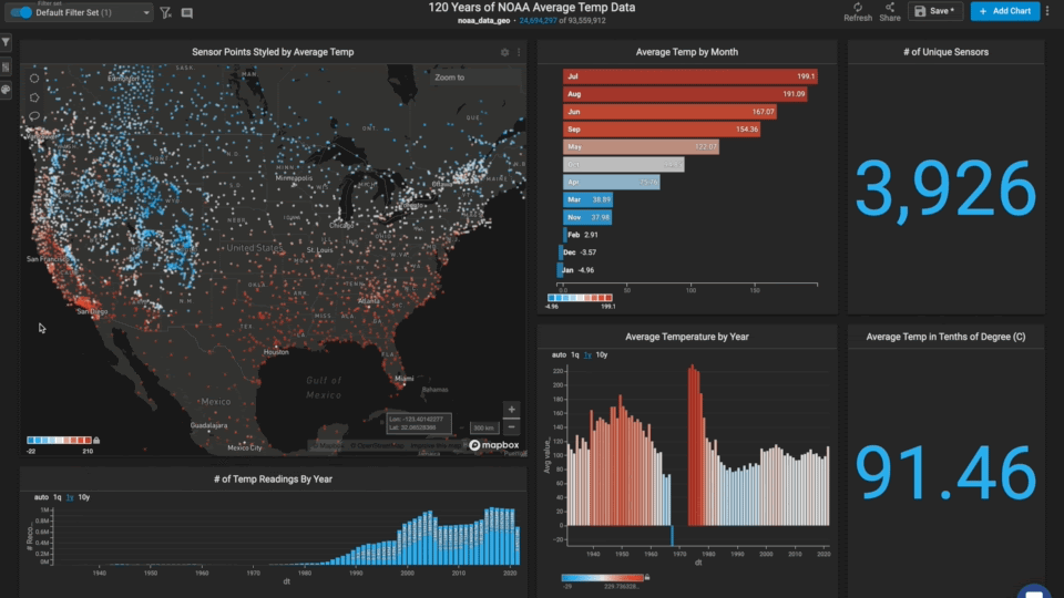
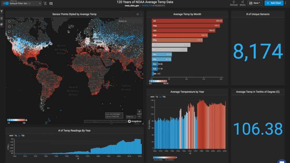
We now had the table we needed to create a map-centric dashboard in Immerse.
Visualizing the Data in Immerse
We used several chart types in this dashboard to enable users to explore and find interesting trends.

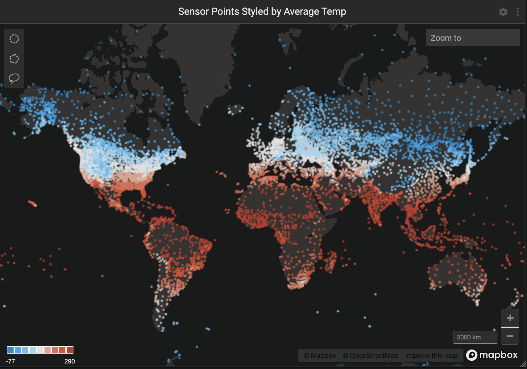
Point Map
The largest chart was the point map which lent itself well to the global geospatial dataset.
We styled the point color by average temperature value, making for an intuitive red to blue gradient from the tropics to the poles.
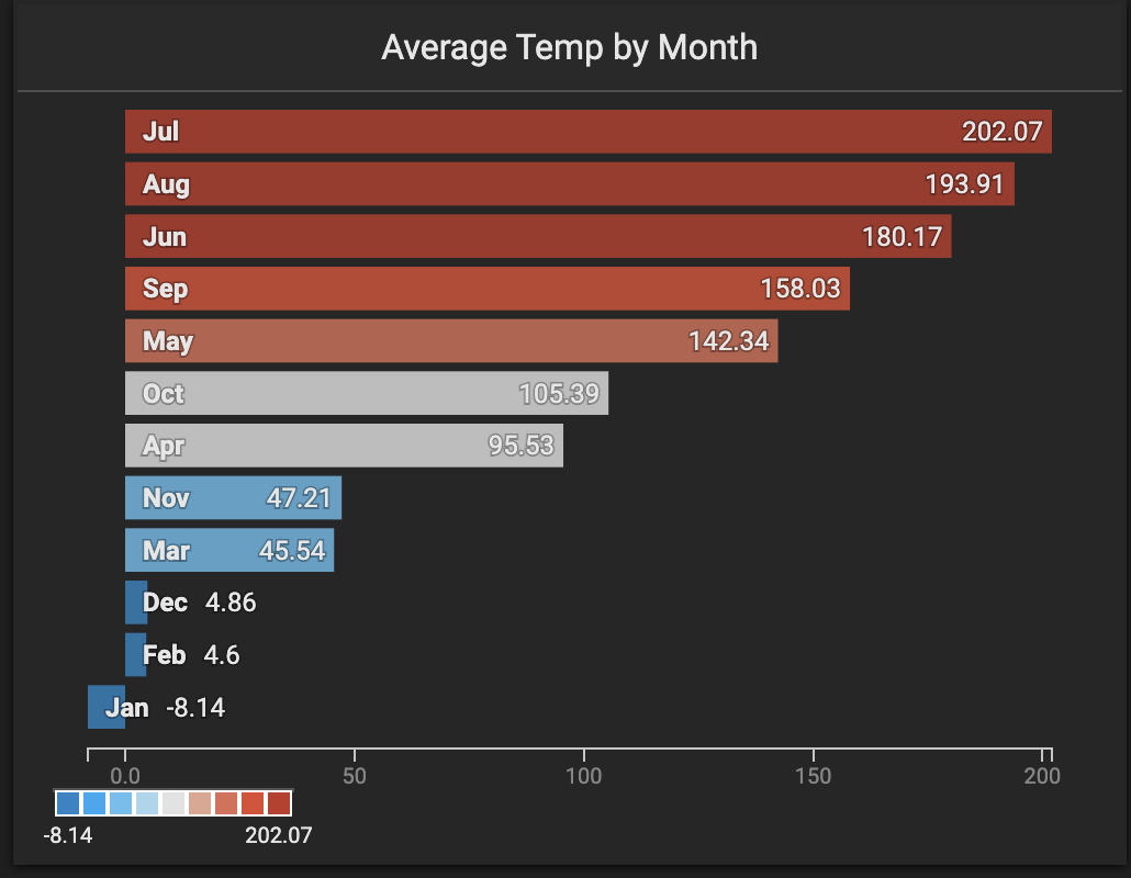
Bar Chart
We used a bar chart to allow the user to filter by month of the year.
The bars were styled according to the average temperature value, allowing the user to connect the map points to the bar points.
New Combo Charts
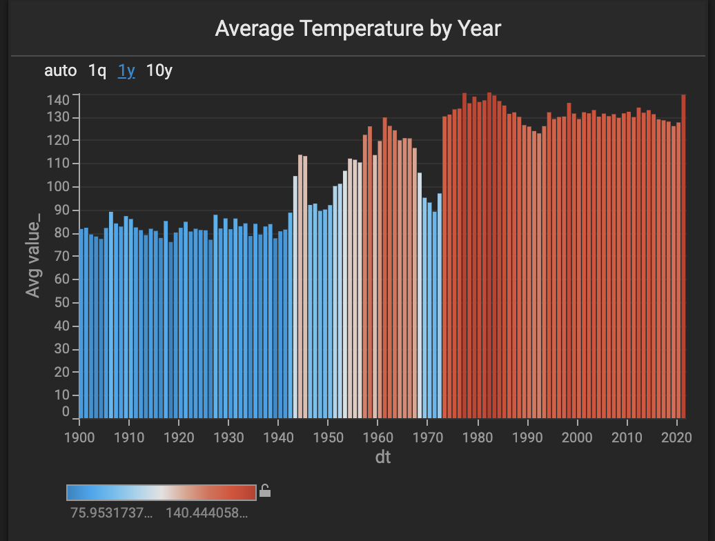
We used the new combo chart to show the average temperature by year. This chart allows the user to see global and regional temperature trends.
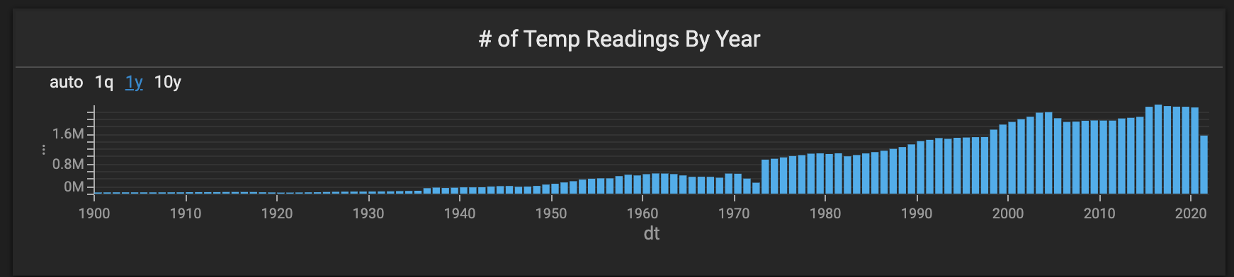
We also used a new combo chart to show the number of records by year. This chart allows the user to see how many more records were captured in the last 30 years than the previous ~200 years.
Number Charts
Finally, we used a number chart to show the average temperature and the number of unique stations in the view.

Other Thoughts and Suggestions
The temperature values seemed a bit odd until we read through the dataset docs.
The five core elements are:
- PRCP = Precipitation (tenths of mm)
- SNOW = Snowfall (mm)
- SNWD = Snow depth (mm)
- TMAX = Maximum temperature (tenths of degrees C)
- TMIN = Minimum temperature (tenths of degrees C)
The temperature values shown are tenth of a degree celsius. It could be more intuitive to show them in full degrees, which can be achieved using these queries:
If you end up using the whole dataset with the precipitation or snowfall records, you could leave value_ as is or perhaps create columns for millimeters and degrees.
Exploratory Data Analysis in Immerse
Now that we had the data loaded and the charts created, we were ready for the best part: exploratory data analysis. One of the first things we tried was using the map lasso to see how the tropics compared to the polar regions.

In general, the tropics have not seen very much temperature change on a year-by-year basis. The poles, on the other hand, seem to have changed quite a bit.

The average yearly temperature used to be significantly colder many decades ago compared to recent years. It becomes apparent that the average temperature is above freezing, whereas it used to be below.
Missing Years
As you zoom around the world and/or lasso different regions, you notice that other areas are missing multiple years of data (for those stations).
The western US seems to be missing many years in the 1950s and 1960s.
Europe is missing data around World War I.
Exploring the Link Between Temperature and Violent Crime
One hundred twenty years of average temperature data is undoubtedly exciting on its own. But this data can get even more interesting when combined with other data.
Many researchers and journalists have explored the link between violent crime and heatwaves, so we thought it could be interesting to do the same.
We decided to focus on New York City since it has a high population, significant temperature differences between winter and summer, and great open data.
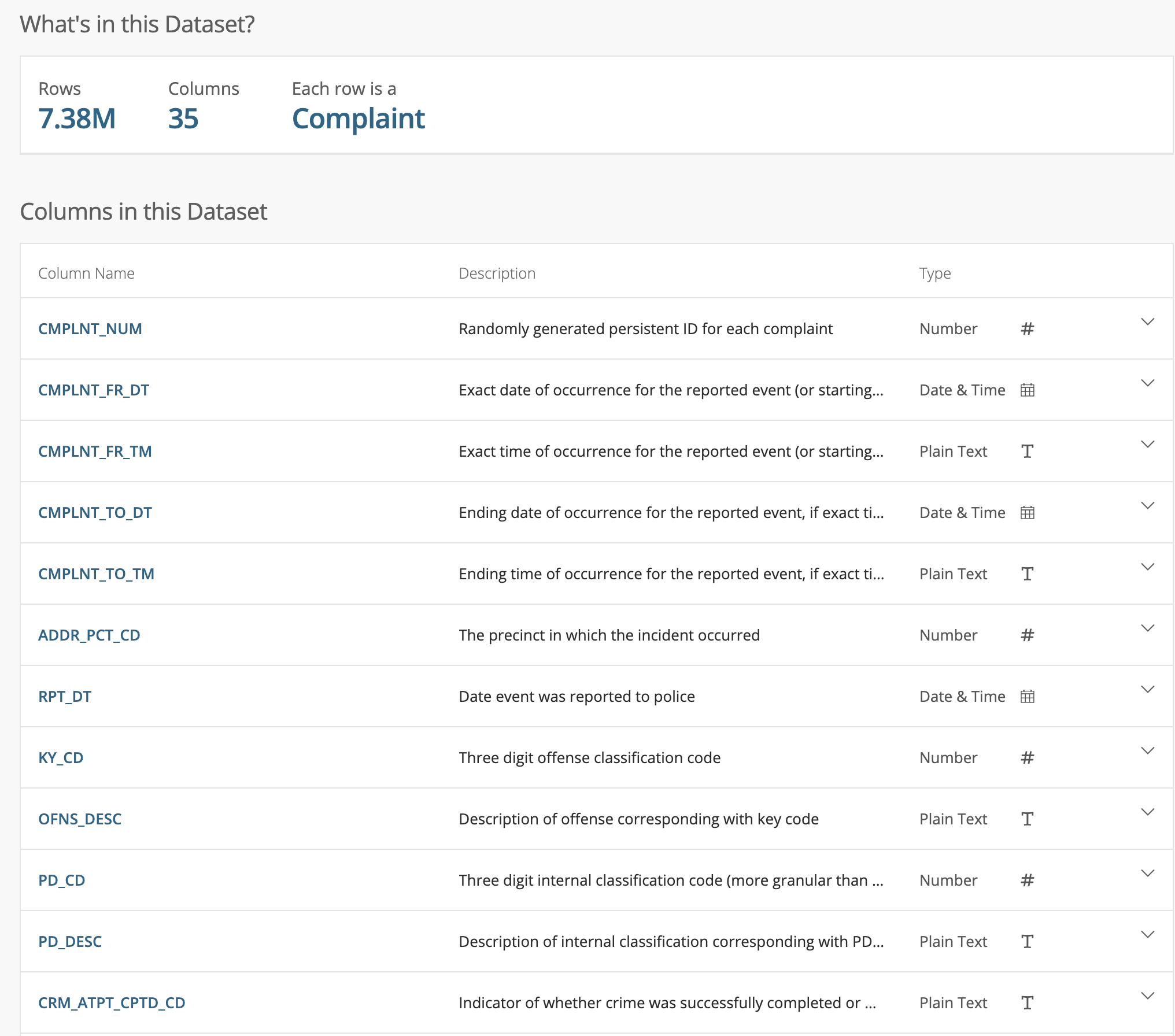
The NYC historic crime complaint data has 35 columns and 7M rows. We brought the dataset into a Python notebook and saved only a subset of the columns (latitude and longitude, crime type, date, etc.) to compare it to the NOAA data.
We then imported the CSV file into an HEAVY.AI table using SCP and the COPY FROM command. We wanted to focus on the relationship between temperature and violent crime, so we created a new table with only the violent crimes:
We also created a new table with only the NOAA data in the NYC area:
We had one table with NYC violent crimes and another with NOAA temperature readings for the five sensors in that area.
We calculated that there was a weak positive correlation (.42) between the number of daily violent crimes and average temperature using this query:
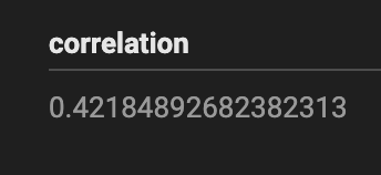
We wanted to double-check our query/math, so we brought the data into a Jupyter notebook and used Pandas' .corr to check our .42 number.
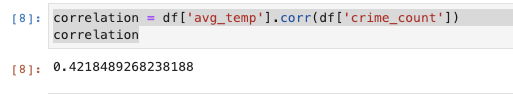
This correlation generally aligns with research on temperature and violent crime. It would be interesting to see how this varies on a per neighborhood basis and how this correlation changes depending on poverty levels.
Wrap Up
In this post, we explored several steps that are common when doing exploratory data analysis in HEAVY.AI:
- How to import CSV files into HEAVY.AI using PyHEAVY
- How to do attribute joins between datasets with a common id (e.g., join key)
- How to use multiple chart types to create HEAVY.AI dashboards
- How to perform spatial joins and calculate correlations
- How to use the New Combo Chart to explore relationships between two tables in HEAVY.AI (temperature and violent crimes in this case)
The NOAA dataset is a fascinating one, and we will explore it more in future posts. Stay up-to-date with the HEAVY.AI blog and look out for more deep dives into the spatial analysis.
Share any cool maps and dashboards you create with us on LinkedIn, Twitter, or our Community Forums!