Boost Visual Analytics Dashboard User Experience with Parameters
Try HeavyIQ Conversational Analytics on 400 million tweets
Download HEAVY.AI Free, a full-featured version available for use at no cost.
GET FREE LICENSE
Advanced analytics, business intelligence (BI), and the data that drives them are largely unused by the organizations that invest heavily in their promise.
Industry insiders and analysts took notice of these trends and have reported on them regularly in recent years.
According to Gartner, 97 percent of organizational data goes unused, and 87 percent of organizations have low levels of BI and advanced analytical maturity.
Numerous factors contribute to these challenges, and we're not going to pretend that we know them all or that there's an easy fix.
Still, our users have shown us that enhanced usability is a focused approach for analytics dashboard software companies, like ourselves, can take to improve application stickiness.
With these needs in mind, we introduced new visual analytics dashboard parameters in HEAVY.AI version 5.6 and hardened them in HEAVY.AI version 5.7.
But what are dashboard parameters? How do they make HEAVY.AI data analytics dashboards more user-friendly? And how do they improve the process to build analytics dashboards that uncover new insights?
This post will give an overview of dashboard parameters, show you how to set them up, and provide an example of how parameters promote a user-centric workflow.
What are Visual Analytics Dashboard Parameters?
Parameters are helpful tools that shape HEAVY.AI's front-end user experience.
Think of them as a series of inputs and HEAVY.AI dashboard components (e.g., chart filters, titles, legends, etc...) as the corresponding outputs.
Each user-specified input can change dashboard values in significant and valuable ways.
For instance, parameters enable dashboard creators and consumers to:
- quickly switch measures and dimensions on a chart from a centralized location or widget
- control chart-specific filters on multiple charts at a time to compare scenarios, estimations, or projections
- enable all dashboard tabs to reference the same data
- and improve dashboard readability by automatically changing dashboard elements like titles, filters, and more
Previously these changes could only be made at the individual chart level. Now users can alter values from the Parameters pane, manager, or dashboard widgets.

Setting Up and Managing Parameters
The setup and management of dashboard parameters start in the Parameters pane. Here you can:
- access the Parameters Manager to create, edit, and delete parameter definitions
- add and remove parameters to and from a dashboard or dashboard tab
- make a parameter dashboard-wide or localized to the selected dashboard tab
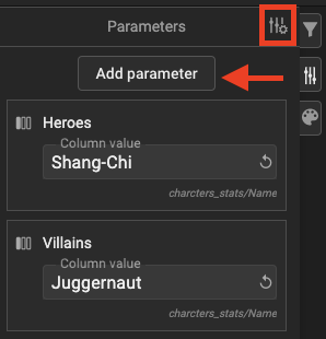
Clicking the Parameters tab on the left side of the dashboard opens the Parameters pane.

Once inside the Parameters pane, click Add parameter to open the Parameter Manager.

Click Create New at the bottom of the parameters list or the Open Parameters Manager icon to create a new parameter.

(From top to bottom)
With the Parameters Manager window open, you can create, modify, or delete one of four different parameter types:
- Column: a column within a user-specified table
- Column Value: a domain value within a table column
- Number: a numerical value with options to include a minimum and maximum
- Custom: a flexible value that can be a SQL formula, a numeric, or a string

Once you create a parameter, you can find it in the parameters list on the left pane of the Parameter Manager. Here, you can search for parameters, see their types and default values, list them in ascending or descending alphabetical order, or delete them.

On the main visual analytics dashboard, in the Parameters pane, you can see the parameters used on that dashboard or tab, as well as;
- Add and remove parameters
- Change their values
- Determine whether they are applied locally to a dashboard tab or across all tabs on that dashboard
- Add a parameter to the dashboard as a widget

Note that you can only remove or delete a parameter if a dashboard component is not using it.
Parameters in Action: A Comparative Analysis
Now that you know how to set up and manage parameters, let's take a quick look at an example of how they boost user experience,dashboard usability, and streamline data analytics dashboard design.
Recently we came across a series of datasets on Kaggle that represent comic book character stats, powers, physical features, and publication history.
We thought it would be fun to build a dashboard using parameters that would allow a user to quickly compare the stats and powers of the heroes and villains of their choice.
Parameterized widgets were the perfect tool for the task!
We configured two parameters for our comparison that we applied to chart-specific filters and allowed users to select their preferred characters from drop-down widgets.
We used the character stats table from the Kaggle database above to create two column value parameters that use the character name and alignment columns to split the characters into hero and villain groups.

The combo charts in the dashboard representing the hero and villain stats point to their corresponding parameter are controlled from convenient widgets above each chart.
This experience was made possible by adding the parameters to the dashboard from the parameters pane and adding filters to each combo chart that point to the hero and villain parameters using the command ${.
When typed into a dashboard component, that command immediately pulls up the parameters pane and allows you to select a parameter.

So, instead of asking the user to go into each chart every time they'd like to change the characters they're comparing, you can have them click a drop-down and search for their desired character by scrolling or typing the character's name.

While this example is simple, it's symbolic of the enhanced usability features that keep users coming back to well-built dashboard for data analytics. If they find that it's easy to navigate and use, they will more than likely get more value out of that dashboard and use it more often to make data-driven decisions.
Now it's your turn to make analytics dashboards easier to use with parameters!
Share your uses of dashboard parameters with us on LinkedIn, Twitter, or our Community Forums.
And if you are interested in learning more about the Comic Book Heroes and Villains Comparison Analysis examples we used in this post, check out our video here!


